Branding, Logo, Brand Identity, Website, Newsletter, Social Media , iOS/Android App (UI Design on it’s way)
TOLKIT
Adobe: Photoshop, Illustrator, InDesign, XD
Forte is the imaginary company for a classical musicians booking service to public and private events. The musical symbol forte means “loud”, and this shows that the selection of musicians are captivatingly loud. The company offers an easy way to book professional musicians in a classy way. It is their forte so to speak.
I built up the visual language with minimalism, sharp corners, and an absence of color. Its restrained design creates a no-nonsense atmosphere where the product speaks for itself and the texts are to the point.
The choice to keep it grayscale was both a conscious decision as well as a necessary one. It is a design made to create a serious and trustworthy feel as well as a necessary one to keep all the different styles of performance and profile pictures presented to belong to the same visual family.
This is an ongoing project that will grow with more assets during the year.
Logo
The logomark is built from the dynamic symbol forte, redrafted to match the font Glamor used in the logotype. The smoothness of the lines as well as the curves calls to elegant high end music.
The logo is always used with a high contrasting background to the logo color to make it highly visible and easy to read.
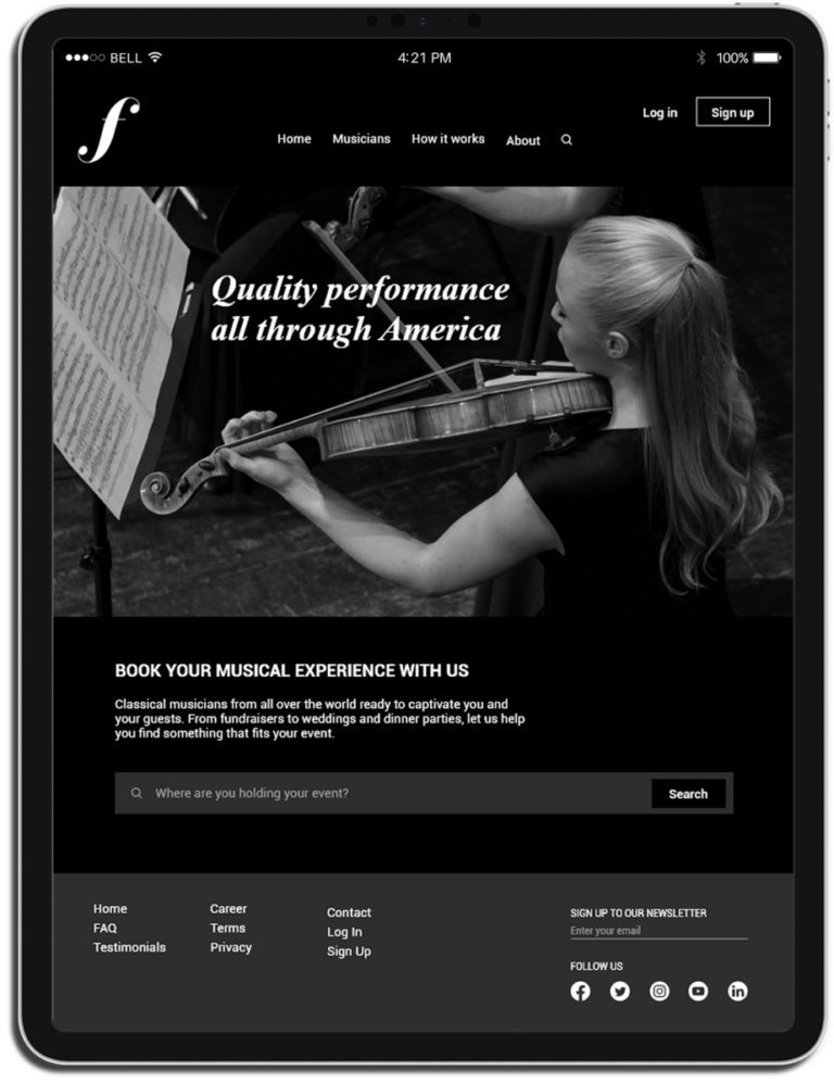
Landing Page
Fortes website is simple yet effective in its way to introduce the company and gets the potential customer to engage with the site.
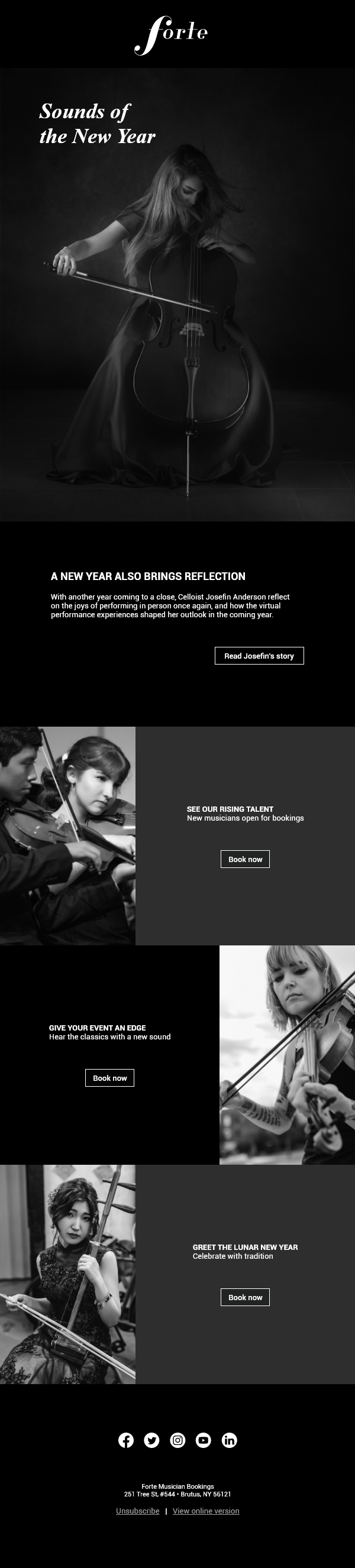
Newsletter
Emails are an effective way to let customers keep up with the company. For Forte, it is also a good way to present new and top-rated performers as well as to remind customers to book musicians for upcoming celebrations.
Banner Ads
Animated GIF ads created to grab users attention and spark their interest.
Examples shown are billboard and leaderboard banners.
The Forte app
For customers to book and keep in contact with musicians, write reviews, and payments.
For musicians to easily keep tracks of their bookings, client agreements, and payments.
(This is a work in progress. Come back later to see the UI Design)
Company Presence
Social media is an essential part of any company’s commercial success.
Brand identity
A good style guide is essential for consistent branding. It helps the designers and marketing team use a shared voice when presenting the company to the world. This brand identity style guide uses the same minimalism, fonts, and color as it advocates.