Layout, Illustrations, Photo restorations, Cover Design, Cover art
TOLKIT
Adobe: InDesign, Photoshop, Illustrator
Njurunda Kvinnokarta is a project to tell the history of women that lived and worked in Njurunda, Sweden. It is researched and written by a group of women with a passion for local history and a longing to see more female representation.
Since I myself grew up in Njurunda, the subject matter was close to my heart and it became a passion project for me.
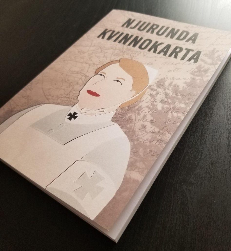
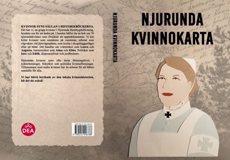
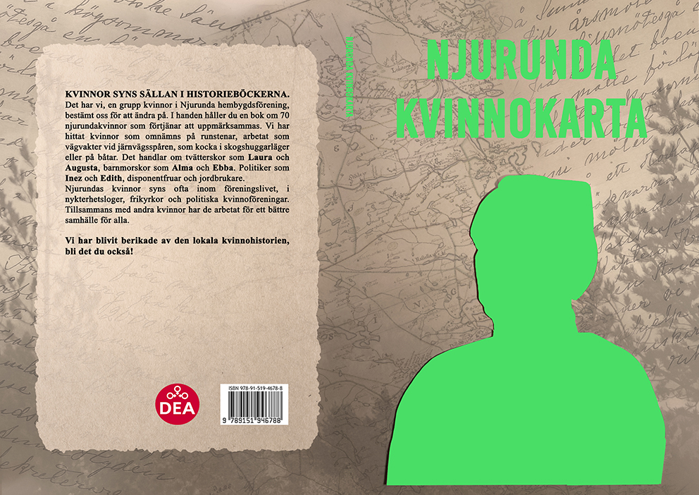
Book Cover
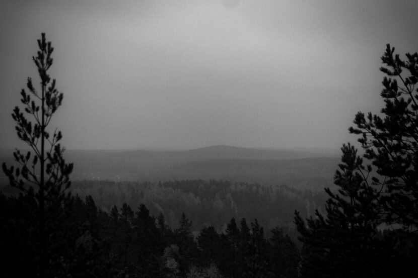
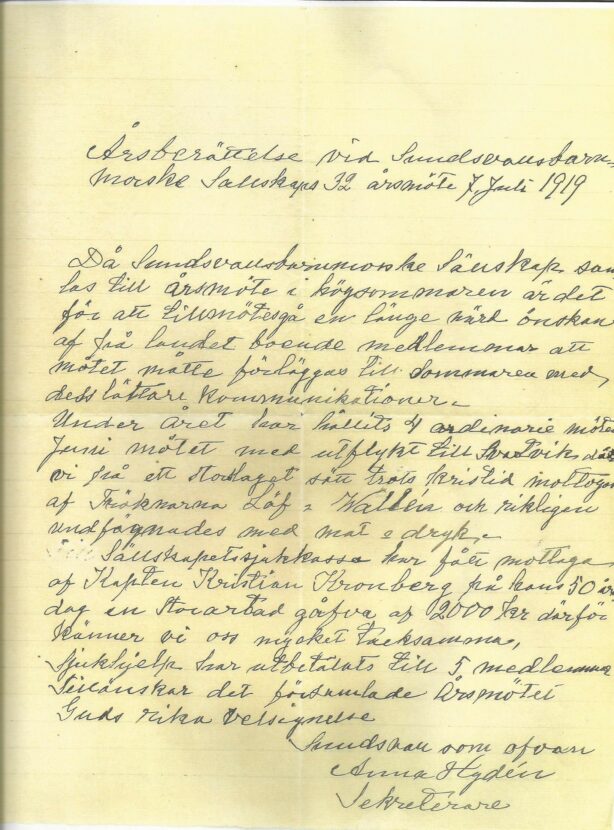
The cover background is a compilation of images (map, letter, and nature photography) from and around Njurunda where the book is set. The front cover portrait, which is based on a woman featured in the book, was digitally illustrated and cut out on a cutting machine that was then photographed and then edited.
I went with a theme and color scheme that clearly showed the historical aspects of the book.
Layout
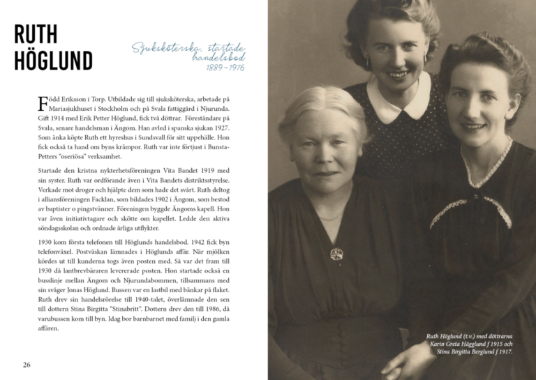
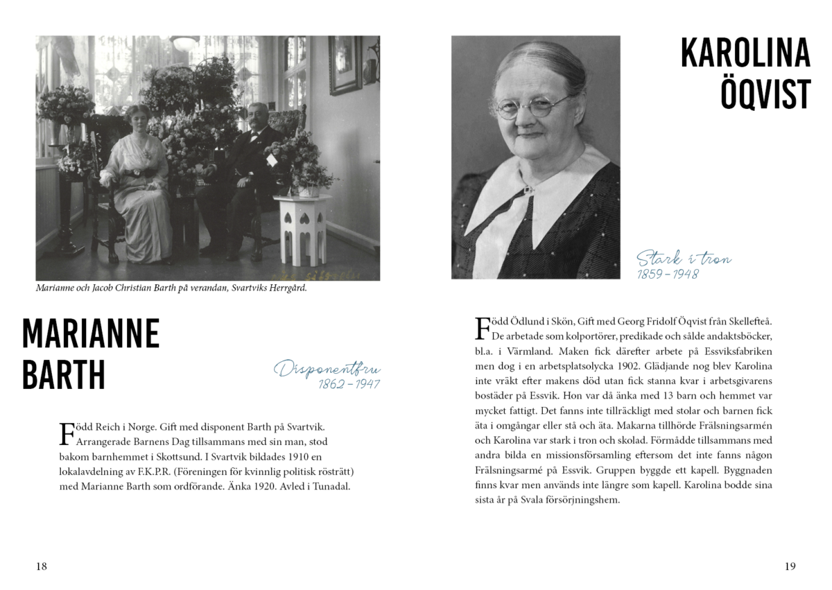
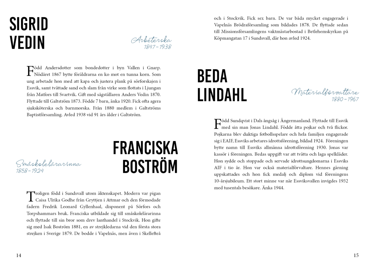
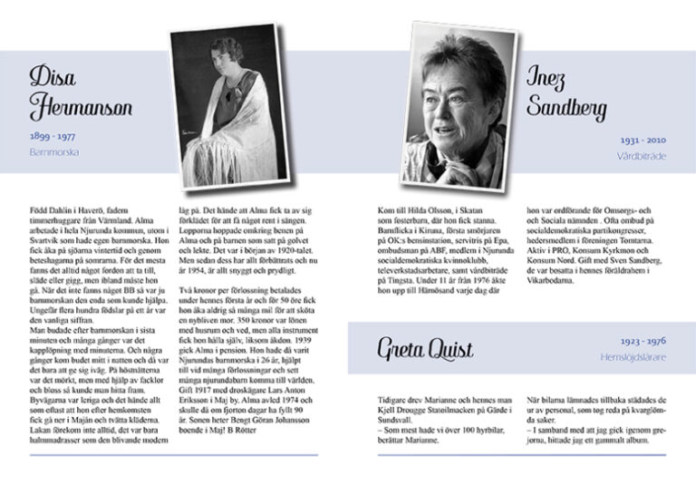
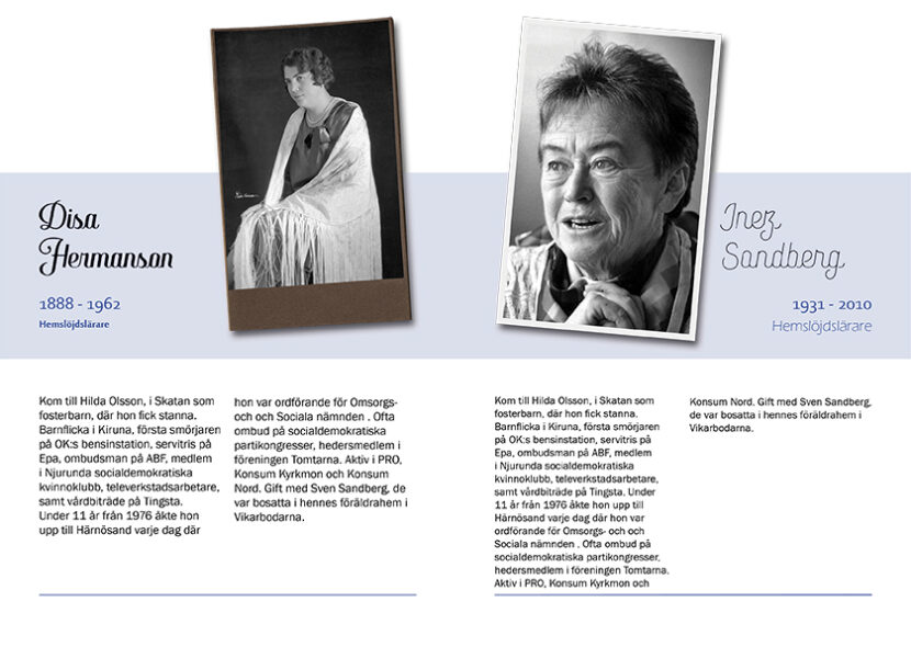
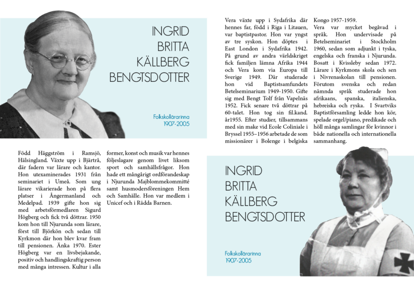
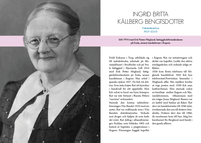
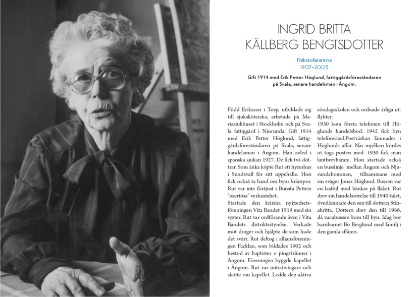
For the layout, I focused on creating clear sections for the featured profiles so the reader had an easy-to-consume overview. The historical woman’s name stands big and bold as a focus point. Her profession and living years is written in blue cursive; easy to find and at the same time giving a decorative flair to the otherwise straight and square layout.
It was important for me to let the reader meet the women in the book, so when we had access to high quality photos, I opted to make a whole spread with the featured woman.
At the start of the project, there was a request to present all the women in alphabetical order, but due to the nature of the image assets and text length, we had to rethink this aspect.
The women are introduced to the reader more or less in chronological order from their birth year. Some liberties with the order had to be taken to nicely fit everyone in without awkward spacing.
Sketches
I did a lot of sketches and was quickly done first by hand on paper to get an idea of what the client liked.
It moved over to the screen to get a better idea of what would work and not.
Since the client wanted to save on printing costs, they had a request to keep the images small and for the text to take up most of the space.
After showing the client what their request would look like and presenting them with alternatives where the text had visual room to breath, they opted for the second alternative.
I then went back to working on a few more digital sketches with the feedback from the client in mind.
After showing the best of the new sketches and deciding on a direction, I could finally pinpoint my fonts and start working on the book as a whole.
Photo Editing
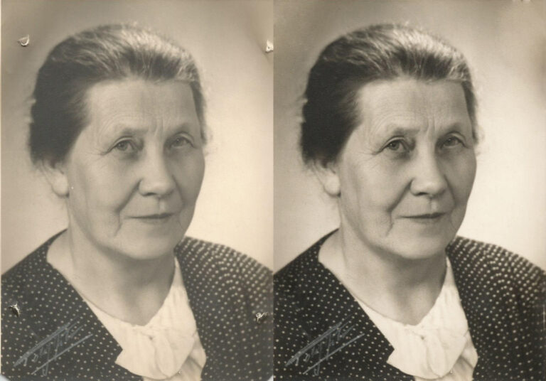
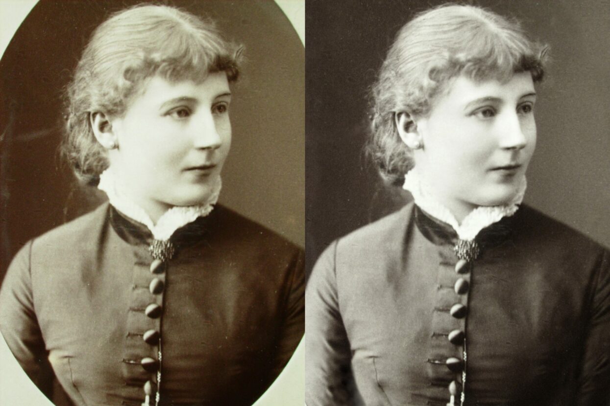
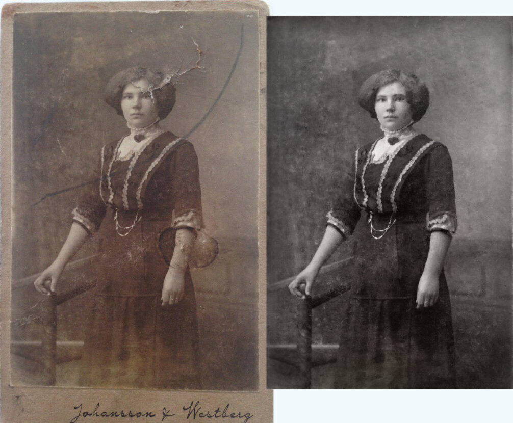
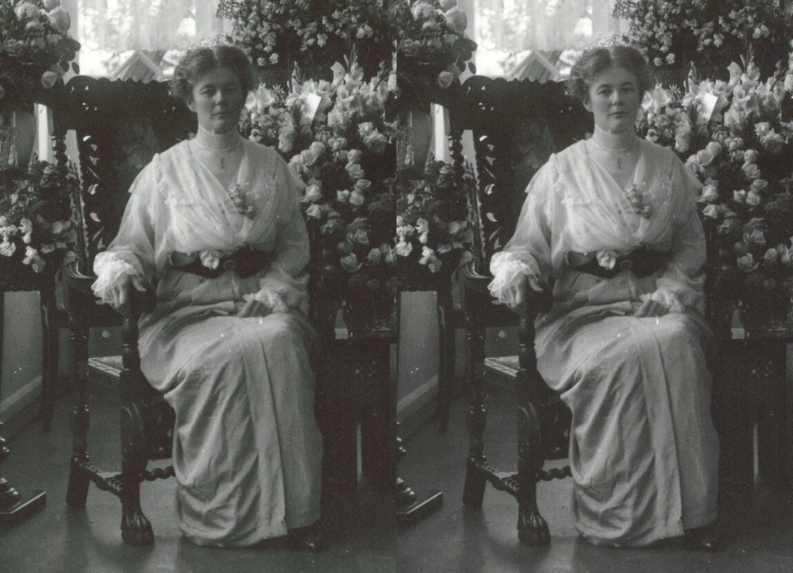
Working with historical material meant that many of the photos that were available to us were in need of an edit before going to print.
Most time spent in creating this book was spent on image restoration. Some photos were newer but still needed a background cleanup to put the focus back on the person in the picture.
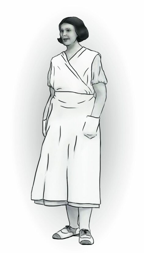
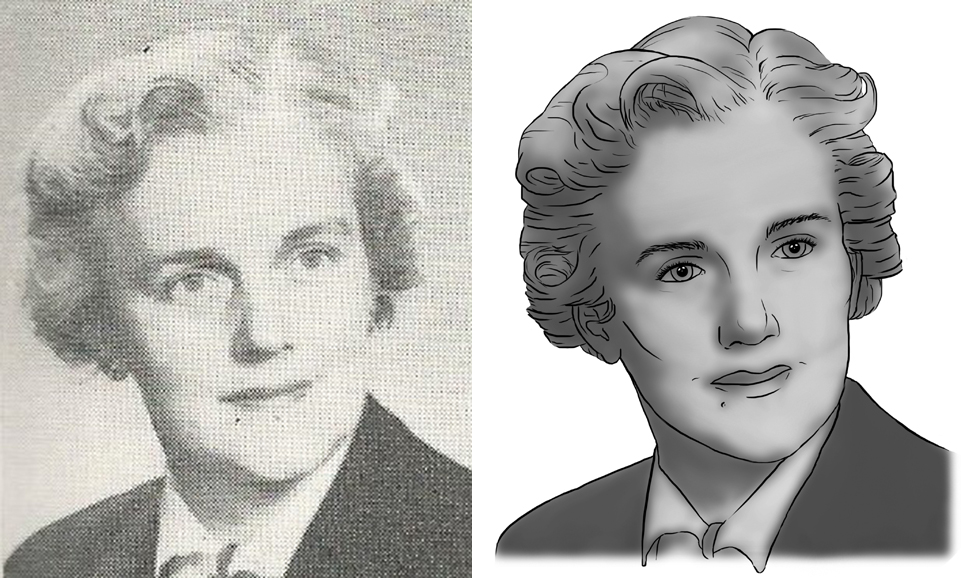
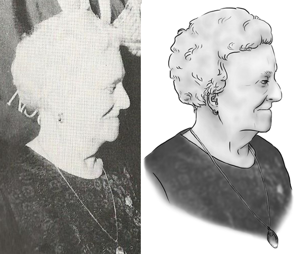
Since the search for photos of the featured profiles was a somewhat difficult job, much of the material that was given to me came from older books with halftone prints, low resolution images from the internet, and photos of photos that relatives taken. Some of the images was good enough for print after I’ve worked on them, but the the worst quality ones had to be turned into illustrations.
Illustrations
A need for illustrations grew when much of the photo material too poor quality for print.
The first thought was to find and bring in another local female illustrator, but when the timeline and budget presented a challenge, I decided to work with the illustrations myself.
To have time to work through all the twenty-three illustrations I used a technique where the original photos provided a base layer of shadows and highlight; this gave some depth to my linework. The illustrations were drawn with a graphic tablet in Photoshop.
Spreads
A few samples from the book. To buy the 100 page book (in Swedish) please head over HERE.